How to Choose Paint Colour and Finish for a Room
Choosing paint is about more than finding a colour you like on a small sample card.
A colour that looks perfect in a showroom can feel completely different once it is on the walls at home. Lighting, undertones, flooring, furniture and even the direction a room faces can all affect how paint looks. The finish matters too, because matte, satin, semi-gloss and gloss surfaces all reflect light differently and suit different areas of the home.
Taking a little extra time before committing can help you choose a colour and finish that works well in the actual room, not just on a swatch.
Start With the Room, Not the Paint Card
Before looking at colours, think about the room as a whole.
What flooring is already there? What colour are the curtains, furniture, kitchen cabinets or benchtops? Are there timber tones, cool greys, warm neutrals or bold colours already in the space?
Paint needs to work with what is already in the room.
For example, a warm white may look beautiful beside timber flooring, while a cooler white may work better with grey tiles or contemporary finishes.
It can help to collect a few colour ideas first, then compare them directly with the fixed features in the room.
Look for Undertones
Undertones are the subtle colours sitting underneath the main colour.
They can make a surprisingly big difference.
A white paint might have:
Yellow undertones
Blue undertones
Pink undertones
Grey undertones
Green undertones
The same applies to greys, creams, beiges and other neutral colours.
A colour with a blue undertone may feel cooler and sharper, while yellow or beige undertones can make a room feel warmer. Pink undertones can create a softer look, while green undertones can work well with natural or earthy colour schemes.
This is one reason choosing “just a white” can become unexpectedly complicated. Put several whites next to each other and the differences become much easier to see.
Check the Colour in Different Light
Lighting can dramatically change the appearance of paint.
Natural daylight usually shows colour most accurately, but even daylight changes throughout the day.
Morning light may make a colour look different from afternoon light, and once the sun goes down, artificial lighting takes over.
Warm globes can make colours appear warmer or more yellow, while cooler lighting may bring out blue or grey undertones.
When testing a colour, look at it:
In morning light
In afternoon light
At night
With the room's usual lights turned on
A colour that looks perfect at midday may feel too cool or too warm in the evening.
Consider the Direction the Room Faces
The direction a room faces can also influence how colours appear.
Rooms that receive plenty of warm sunlight may handle cooler tones well because the natural light adds warmth.
Rooms that receive less direct sunlight can sometimes feel cooler or darker, so warmer whites, creams or soft neutrals may help balance that feeling.
You do not need to follow strict rules, but it is worth considering how much natural light the room receives before making a final decision.
This is especially important in bedrooms, hallways and living areas where the light can vary considerably throughout the day.
Think About How You Want the Room to Feel
Colour has a strong effect on the overall feeling of a room.
Soft neutrals such as whites, creams and gentle greys are often chosen for calm, flexible interiors because they work with a wide range of furniture and decorating styles.
Warmer colours can make a room feel cosy and inviting.
Cooler colours can create a fresher, more contemporary feel.
Darker colours can add depth and drama, especially in bedrooms, dining areas or feature walls.
If you like a stronger colour but are hesitant about using it throughout the room, an accent wall can be a good way to introduce personality without covering every wall.
Do Not Forget the Ceiling and Trim
Wall colour is only part of the picture.
Ceilings, skirting boards, doors and trims also influence how the room looks.
A crisp white trim can create contrast against coloured walls, while using softer whites throughout the room can create a more subtle look.
Some homeowners also choose the same colour on walls and trims but vary the sheen level, creating a more seamless and modern finish.
Whatever approach you choose, make sure the wall colour works with the existing or planned trim colour.
Choose the Finish for the Way the Space Is Used
Paint finish is just as important as colour.
Different finishes reflect different amounts of light and suit different surfaces and levels of wear.
Matte finishes
Matte paint has very little shine and can help disguise minor surface imperfections.
It is commonly used on ceilings and in lower-traffic areas where frequent cleaning is not required.
Because matte surfaces reflect less light, they can create a softer, more relaxed appearance.
Low-sheen and satin finishes
Low-sheen and satin paints offer a little more durability and are commonly used on interior walls.
They are often a practical choice for living areas, bedrooms and hallways because they balance appearance with easier cleaning.
The exact sheen level varies between products, so it is worth comparing samples before choosing.
Semi-gloss finishes
Semi-gloss paint reflects more light and is generally easier to wipe clean.
It can work well in areas such as:
Kitchens
Bathrooms
Laundries
Doors
Skirting boards
Window frames
It is also commonly used on trims because the extra sheen creates a subtle contrast against lower-sheen walls.
Gloss finishes
Gloss finishes create the highest level of shine.
They can highlight architectural details such as doors, trims and mouldings, but because they reflect more light, they can also highlight surface imperfections.
Good preparation becomes especially important when using high-gloss finishes.
Think About Cleaning and Durability
The way a room is used should influence the finish you choose.
A quiet guest bedroom has very different requirements from a busy hallway or family kitchen.
Areas that are frequently touched, wiped or exposed to moisture generally benefit from a more durable, washable finish.
This is particularly important in homes with children or pets, where walls may need cleaning more often.
A beautiful colour is still important, but choosing a finish that suits everyday use can help the room continue looking good for longer.
Test Before Committing
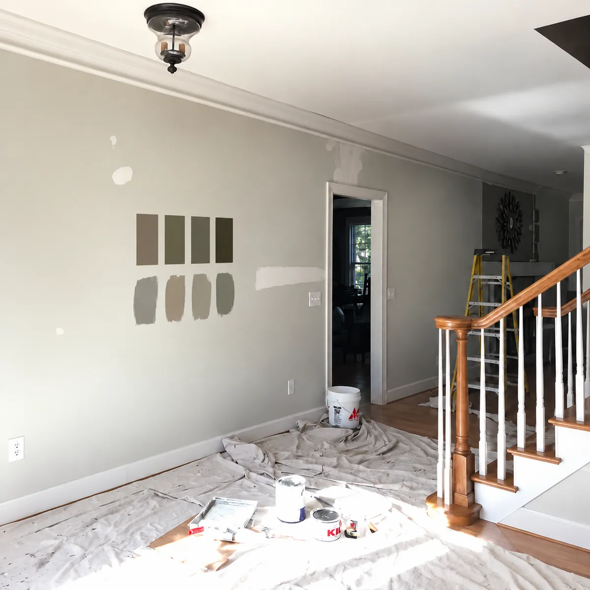
One of the best things you can do before painting an entire room is test the colour first.
Sample pots allow you to see how the colour behaves in the actual space.
Paint a reasonably sized test area rather than relying on a tiny swatch.
If possible, test the colour on more than one wall because different walls may receive different levels of light.
Leave the sample up for a day or two and check it at different times.
Also remember that the finished colour may look slightly different depending on the sheen you choose.
The larger the surface, the more noticeable the colour and undertones will become.
Give Yourself Time to Decide
Paint colour is one of those decisions that is easier when it is not rushed.
Compare a few options, test them properly and look at them beside the flooring, furniture and other finishes already in the room.
A little extra time choosing the right colour and finish can make a big difference to how comfortable and cohesive the room feels once the painting is complete.
And if you are unsure which colour or finish will work best in your space, Rob's Painting & Decorating can help with practical advice as part of your painting project.
